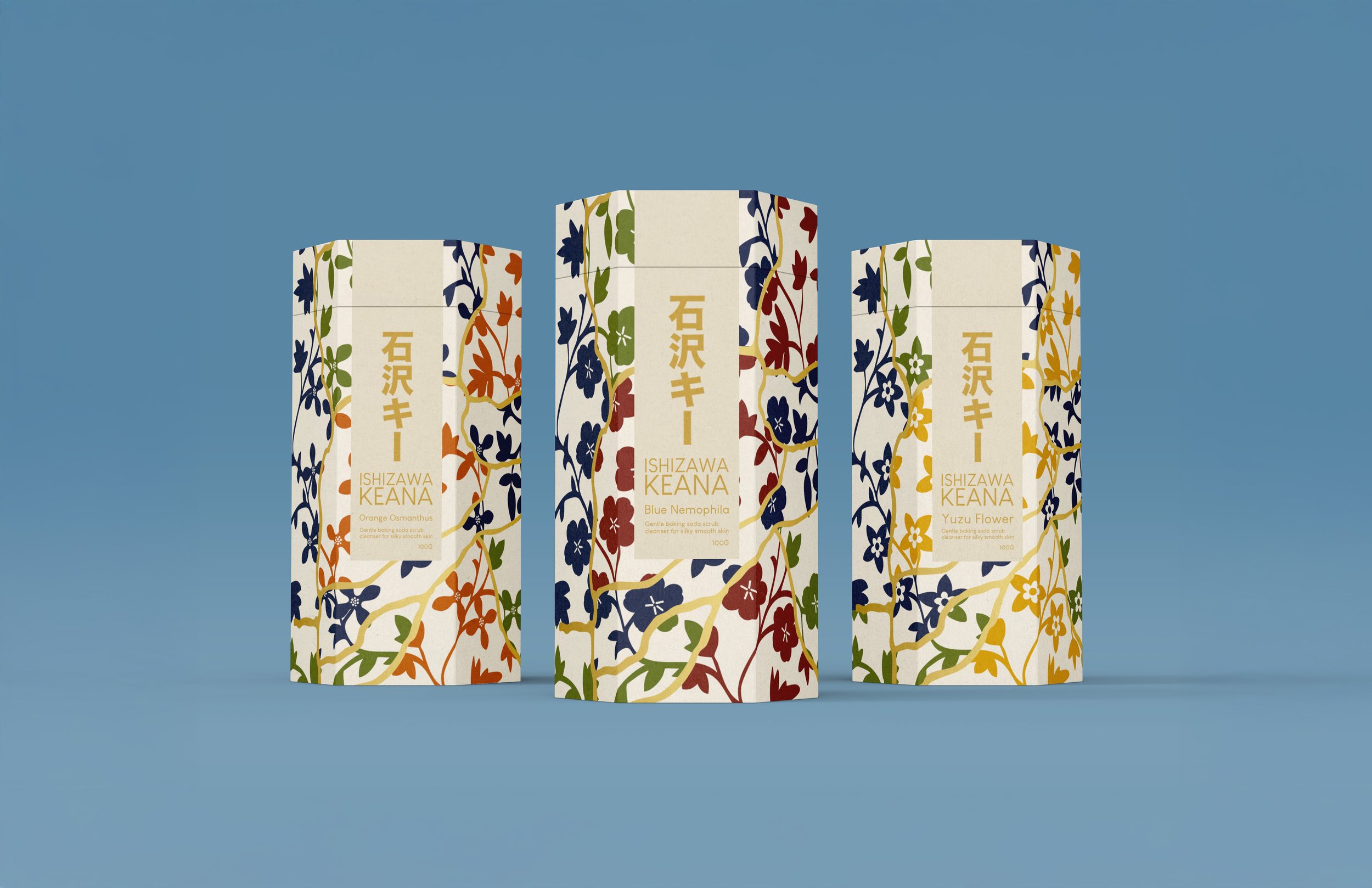
ISHIZAWA KEANA
PROJECT TYPE Packaging Redesign - Student Work
CLIENT Ishizawa Keana
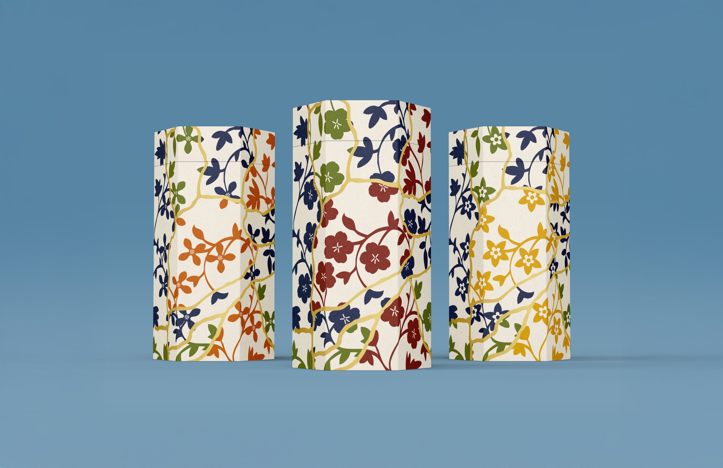
For the rebranding of Ishizawa Keana Baking Soda Face Wash, the packaging is designed in the shape of a long hexagon, symbolizing balance and refinement. Inspired by kintsugi, the Japanese art of repairing broken pottery with gold, the design features delicate gold accents, embracing the idea of beauty in imperfection. Each variant is distinguished by different floral illustrations, representing their unique scents while adding a natural, elegant touch. This redesign blends traditional Japanese aesthetics with modern skincare, creating a visually striking and meaningful packaging experience.